Create a Line Chart
Here we will create a Quarterly Trend line chart. A line chart is used to show trends over time. The dimension is always shown on the x-axis and the key figures are shown on the y-axis.
For more information, see Qlik's Line chart documentation.
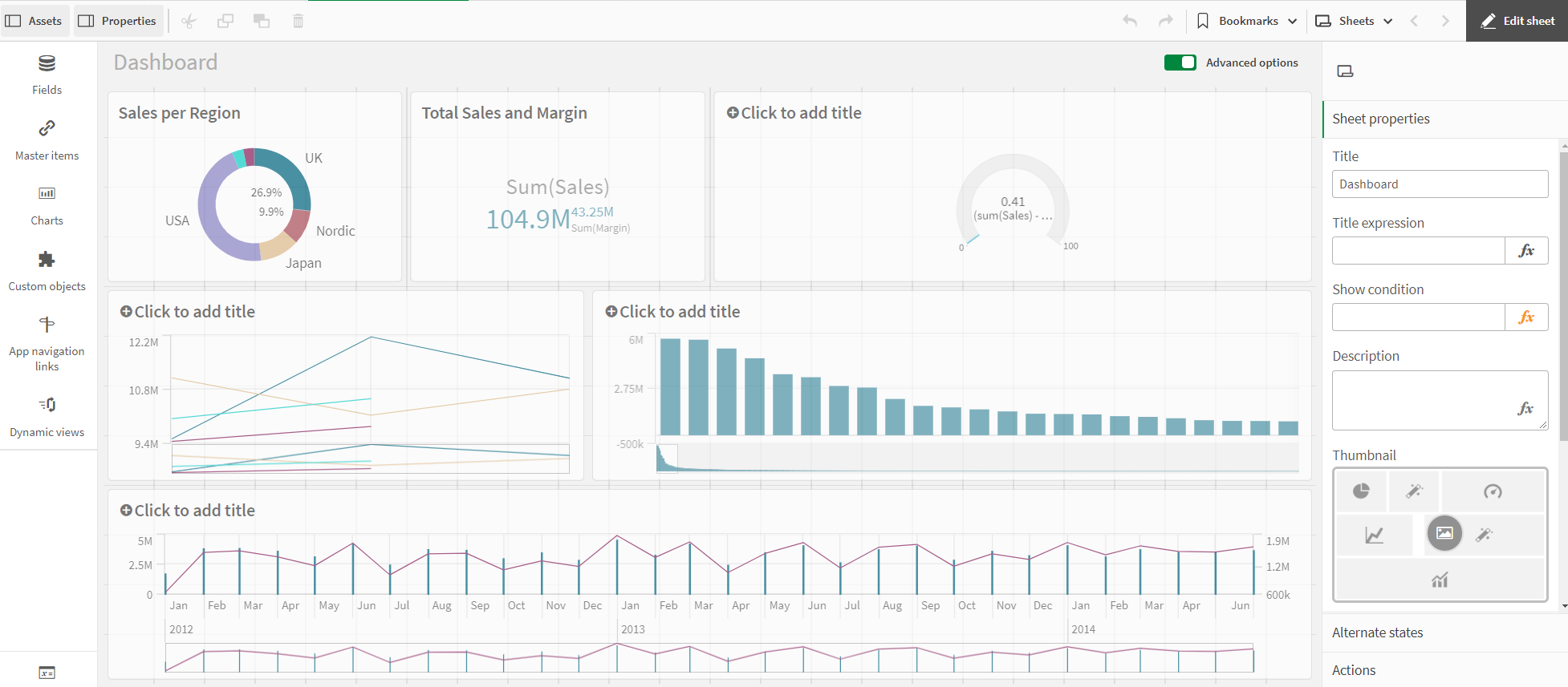
This line chart is used to show quarterly sales trends for the years 2012-2014. The figures for 2014 are for the first half of the year.
Proceed as follows:
-
Click on the + icon to the right of the bar chart to add a new visualization.
-
Under Fields, click on Date > Derived fields. Add Quarter and Year as dimensions.
-
Add Sales as a KPI.
-
Under Properties > Visualizations, click on the line chart icon.
Customizing the charts in advanced edit mode
Once all visualizations have been created, switch to advanced editing mode to customize them. Toggle on Advanced options at the top right.
Proceed as follows:
-
Select the line chart.
-
Under Appearance > Presentation, activate the Show data points checkbox.
-
Click on the chart and add a title: Quarterly Trends.